
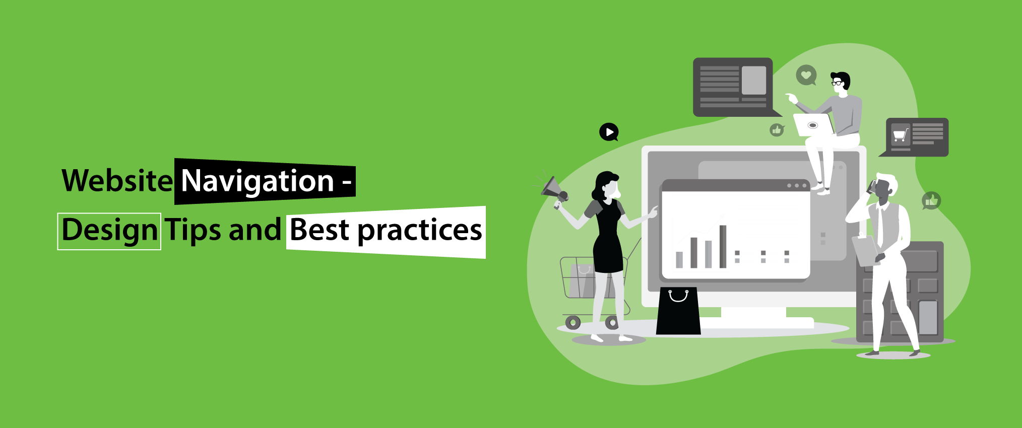
Online promotions and websites have become inevitable with increasing competition. Website development plays an important role in this but without proper UX design, your business may not benefit from your website. Little things can make a big difference and the perfect example of this is website navigation. You can outsource offshore web development company to come up with a stunning website for your business. They will take complete care of your website’s technical and aesthetic nitty-gritties.
Let's start with how navigation affects your traffic and conversion. If the navigation of your site is not working well or is not in sync then it can affect your traffic negatively and hamper the overall user experience. If the website navigation is good and easy, then it enhances the chances to convert customers. IT is crucial for both mobile and web traffic.
Here are some Design Tips and Best Practices to Improve Website Navigation
Avoid Format-Based Navigation
To take your website traffic to another level, the first important one is to avoid format-based navigation. If your site has a lot of content, then you can outsource web design services for best results. Navigation based on the format of the content like photos, videos or white papers is a very bad practice. Your navigation should depend on your services, support and contact details as the visitors are looking for answers and information. They are not looking for a particular type of format for the same.
Navigation based on the format of the content like photos, videos or white papers is a very bad practice.
Limit the number of menus to maximum 7 on your website.
Navigation
Many people consider using the drop-down menus is good practice but this is a myth. This is so because it can be difficult for the search engines to try and crawl this type of menu. You can take help from responsive website development services offered by outsourcing companies to design the best navigation menu for your website.
The beginning and the end of the navigation is crucial because this is where the user attention is. There are 2 reports that you can use to check which part of your navigation system is used by the maximum number of visitors. The first one is the Navigation Summary or in-page” view in the Behavior report and the other one is the user flow report.
Optimize for Mobile
Optimize your website navigation for mobile and computer separately because the visibility is different for both. Taking help from professional website design and development agencies can really aid in designing a website navigation system that improves user experiences and boosts conversions. Website navigation on mobile devices needs to be paid a lot of attention too.
Responsive web design can be summed up in 2 words- “Hamburger Icon”. It’s an icon made up of 3 short horizontal lines, representing a menu. Its appearance resembles a sandwich, so it is popularly known as hamburger icon. It appears in the top right of mobile websites and clicking it displays the navigation menu.
Web designing is not only done to make your site look beautiful and attractive. It is done to give users an amazing experience which is possible only if the navigation system is simple and easy to use.